Chapter 3: Are Home Prices in DC Responding to the Trump Shock?
Compared to other major metropolitan areas, federal employment plays an unusually large role in the Capital Region economy. As a result, even modest reductions in the federal workforce, whether through layoffs, hiring freezes, relocations, or delayed onboarding, can affect local real estate markets. The economic mechanism is straightforward. Federal workers represent a significant share of high-income, stable employment in the region. When that employment base contracts, or when uncertainty about job security rises, housing demand in federally concentrated neighborhoods may weaken. In turn, this can soften price growth, increase the number of homes listed for sale, and dampen transaction activity.
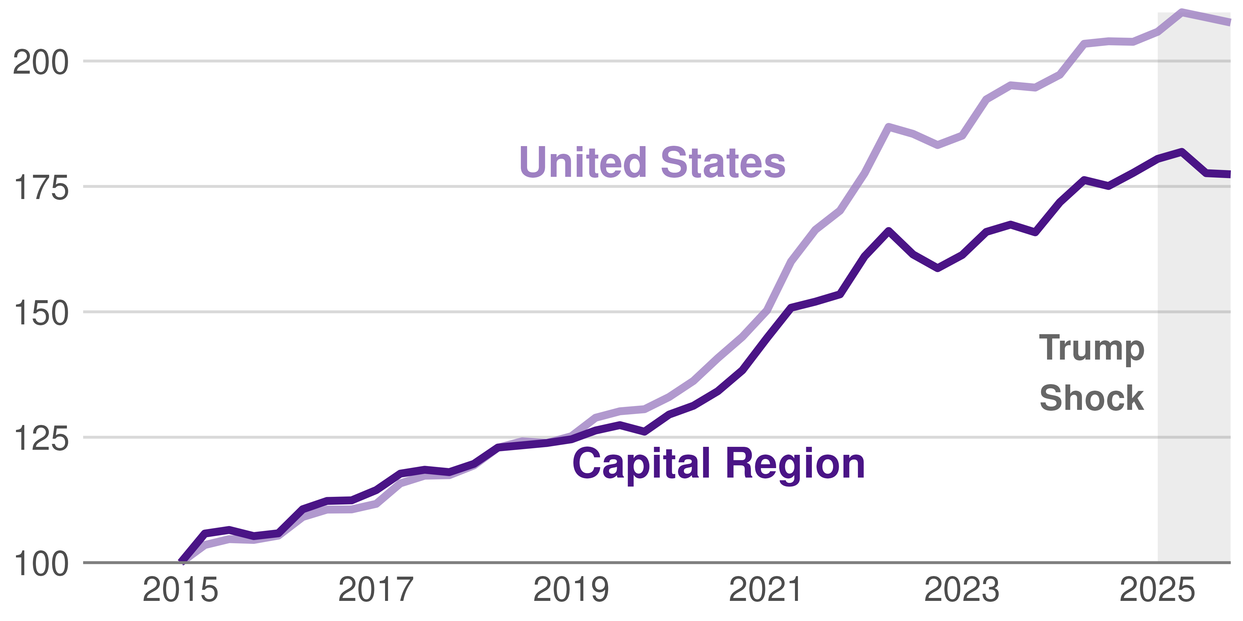
Figure 3.1 shows that Capital Region home values increased steadily over the past decade. From 2015 through 2019, prices rose at a moderate but consistent pace, reflecting a stable post-recession recovery. In 2019, prices were roughly 25 percent higher than in 2015, both in the Capital Region and in the nation at large.
Figure 3.1: DC Home Prices Show a Decade of Strong Growth
Price index, Capital Region and United States, 2015-2025
Source: Bright MLS (Capital Region) and quarterly FHFA Purchase-Only non-seasonally adjusted HPI. Notes: FHFA index estimated using Sale Price Data. See appendix for calculation details.
Beginning in 2020, home prices increased sharply, fueled by the pandemic’s historically low mortgage rates and limited housing supply. When mortgage rates rose substantially at the beginning of 2022, prices began to grow more slowly, both in the Capital Region and nationwide.
Thus when the Trump Shock appeared in 2025, the Capital region started from a position of sustained price strength. Even with the loss of employment and increased unemployment rate, we see no indication of a substantial and immediate price collapse at the metro level.
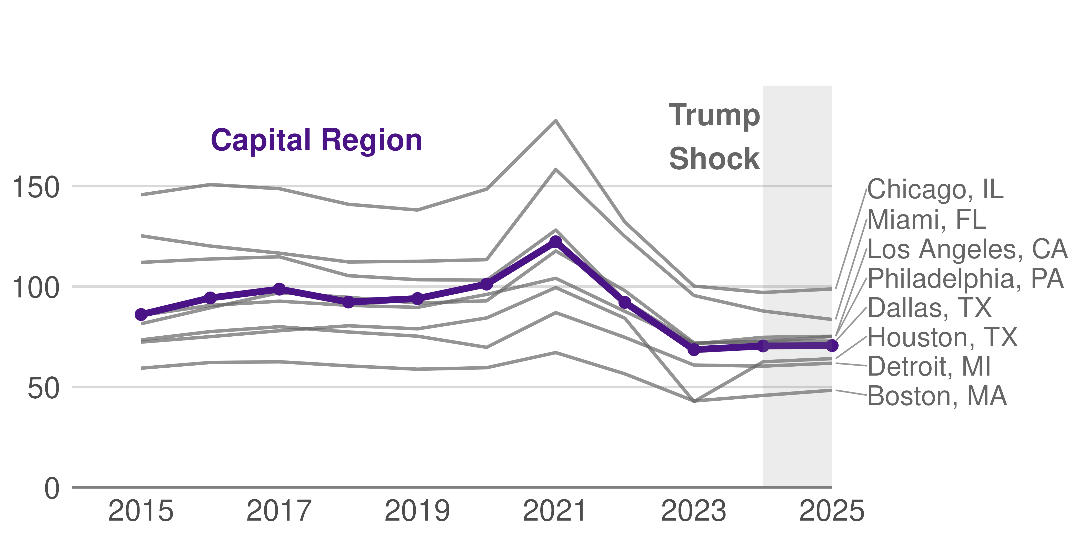
Even if the Trump Shock does not appear in prices, we may be able to see evidence of it in housing transactions. If federal firings drive workers from the Capital Region, we would see an uptick in housing transactions. Until 2024, the Capital Region looked like other similar-sized major metro areas in considering the number of homes sold. Home transactions increased gradually from 2015 to 2019, surged sharply in 2021 during the pandemic boom, and then declined significantly beginning in 2022 as mortgage rates increased and affordability worsened.
Figure 3.2: The Number of Homes Changing Hands in the Capital Region Follows National Patterns
Annual home transactions in thousands, DC against other major metros
Source: Zillow Sales count (nowcast). We aggregate estimated number of unique properties sold by month to an annual total. Notes: For sales count nowcast, the latest month’s number is the estimation after accounting for the latency between when sales occur and when they are reported.
Even with the arrival of federal firings, the number of homes that traded hands in 2025 differed little from the number that transacted in 2024. This pattern in the Capital Region differs little from similar-sized metropolitan areas.
Although prices and transaction volumes seem to be little hit—at least immediately—by the Trump Shock, it is certainly possible that certain areas have been hit much harder. To better isolate the potential impact of federal workforce reductions, we now examine whether home prices decline, or listings and home transactions increase, between 2024 and 2025 in neighborhoods with greater shares of federal employment.
In Figure 3.3, we see that neighborhoods with a greater than median share of federal workers are more likely to have an increase in the number of homes listed for sale between 2024 and 2025. In other words, in neighborhoods where federal workforce reductions, relocation requirements, or heightened employment uncertainty are the most salient, affected households are more likely to try to sell. Even if a worker doesn’t get laid off, the worker may adjust to his or her more risky employment by selling or moving.
Figure 3.3: Listings Rise Disproportionately in Federal-Exposed Neighborhoods
For each category of 2024 to 2025 percent change in listings, difference in number of neighborhoods with more than median share of federal employees
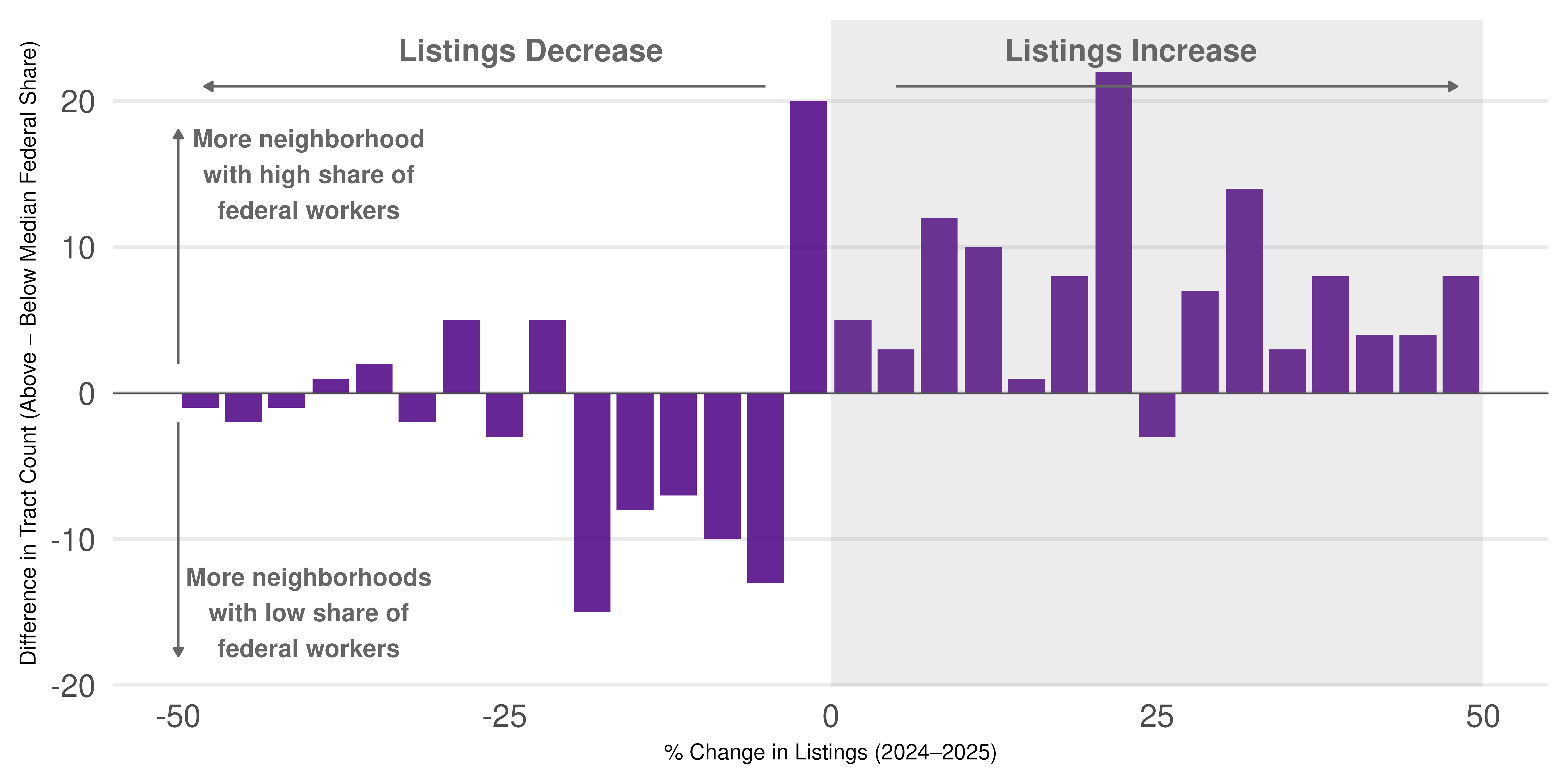
Source: Bright MLS, DC Metro Region Notes: For each census tract, we calculate percent change in home sale transactions between 2024 and 2025, then assign tracts to one of two groups based on whether their federal employment share is above or below the population-weighted median, weighted via ACS tract population. We then bin tracts by their percent change and plot the difference in tract counts between the high- and low-federal-share groups at each bin.
Thus, while the shock to federal employment is invisible in overall Capital Region measures, we do see some—but not drastic—responses in neighborhoods where federal employment share is highest.
Unlike the listing response, Figure 3.4 shows that neighborhoods with higher federal worker shares saw little difference in price growth from 2024 to 2025. While we might expect an increase in listings to increase the total number of houses on the market and therefore moderate prices, we do not yet see much evidence of this occurring.
Figure 3.4: Little Relationship Between Price Growth and Federal Exposure
For each category of 2024 to 2025 percent change in home prices, difference in number of neighborhoods with more than median share of federal employees
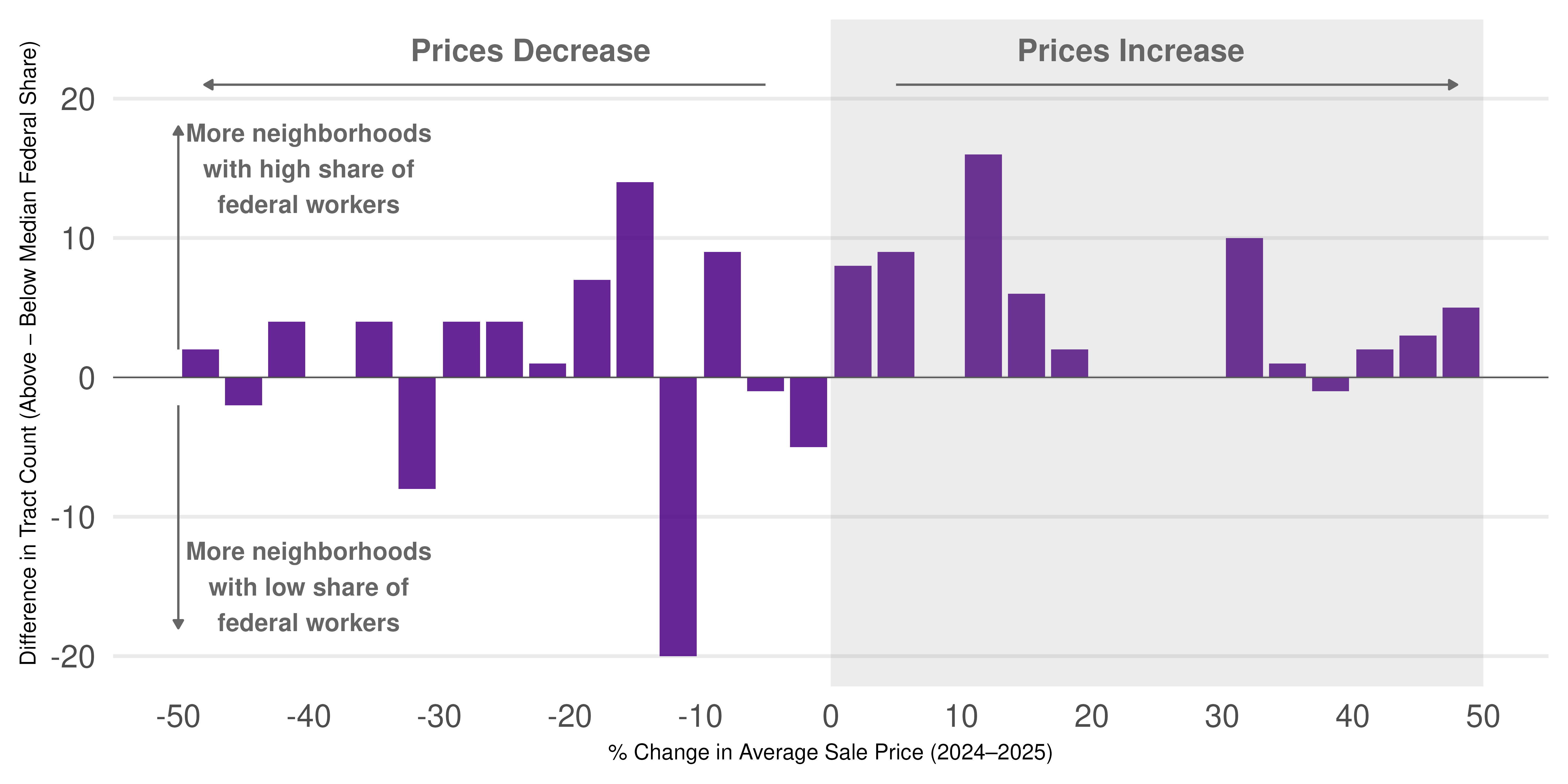
Source: Bright MLS, DC Metro Region Notes: For each neighborhood (tract) calculate the percent change in sale price from 2024 to 2025. For each range of percent change values (e.g., 0 to 2%, 2 to 4%), subtract the number of neighborhoods with below tract population weighted median share of federal employment from the number of neighborhoods with above median share of federal employment. The y axis reports how many neighborhoods in a given category are above the median share of federal employment.
And while listing increased in areas with high federal worker shares, transaction activity—the number of houses that changed hands—also was little increased in areas with high shares of federal employees relative to other areas. Figure 3.5 shows neighborhoods with high shares of federal workers did not see disproportionate increases in transactions. Thus, the imbalance caused by rising listings has yet to soften price growth or lower the volume of home transactions.
Figure 3.5: Little Relationship Between Number of Housing Transactions and Federal Worker Share
For each category of 2024 to 2025 percent change in home transactions, difference in number of neighborhoods with more than median share of federal employees
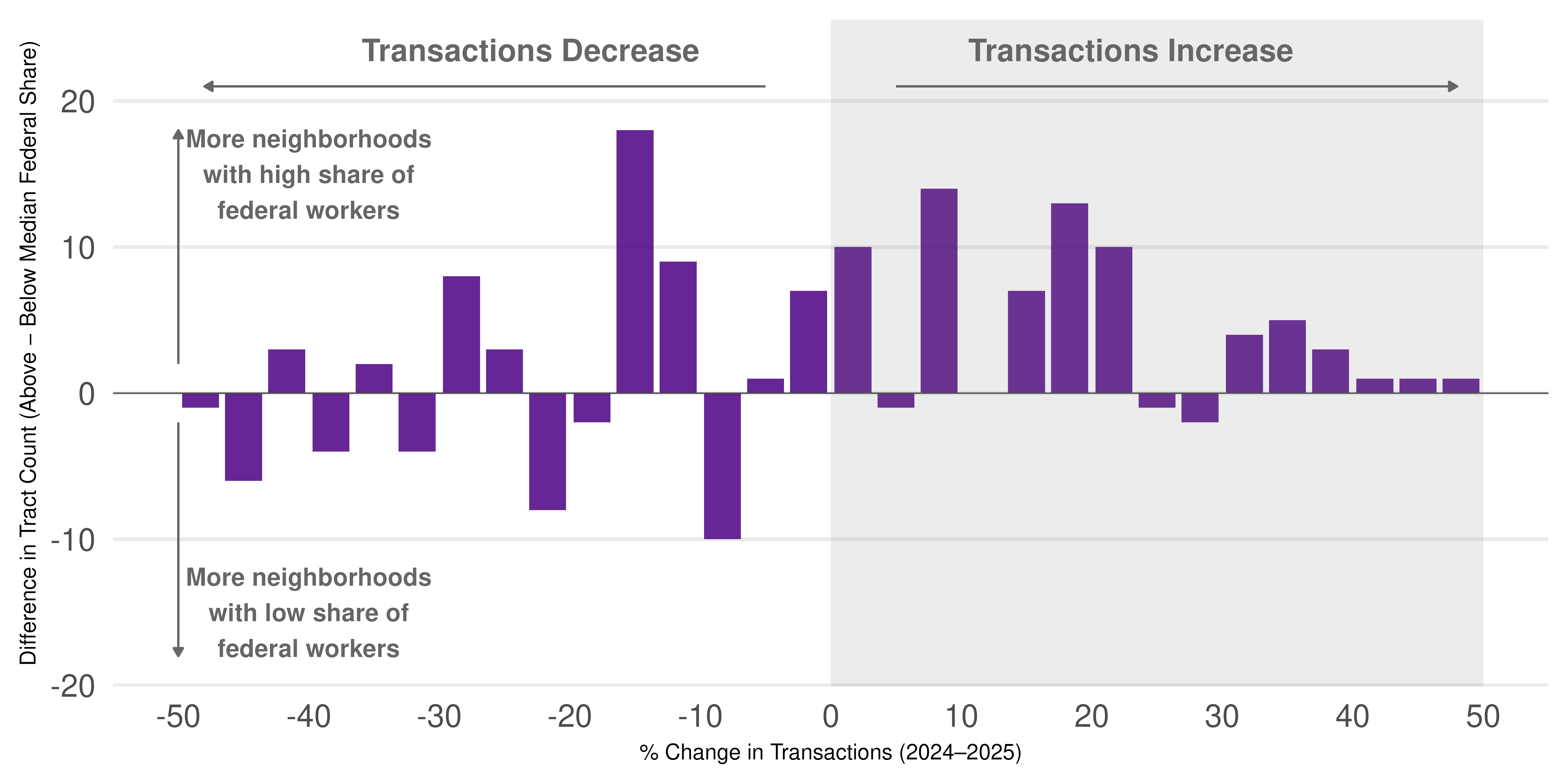
Source: Bright MLS, DC Metro Region Notes: For each neighborhood (tract) calculate the percent change in transactions from 2024 to 2025. For each range of percent change values (e.g., 0 to 2%, 2 to 4%), subtract the number of neighborhoods with below tract population weighted median share of federal employment from number of neighborhoods with above median share of federal employment. The y axis reports how many neighborhoods in a given category are above the median share of federal employment.
In sum, the Capital Region’s housing market appears broadly stable and is largely following national patterns. However, neighborhoods with high shares of federal employees are showing some early and tentative signs of weakness: increases in home listings, but little change in price growth or transaction volume. If some neighborhoods are hit particularly hard by the reduction in federal workforce, yielding heightened employment uncertainty, we may expect more of these changes in the future.